Project Description
Hackathon projects are events, typically lasting several days, in which a large number of people meet to engage in collaborative computer programming. These events were actively promoted whilst working at NCC Group.
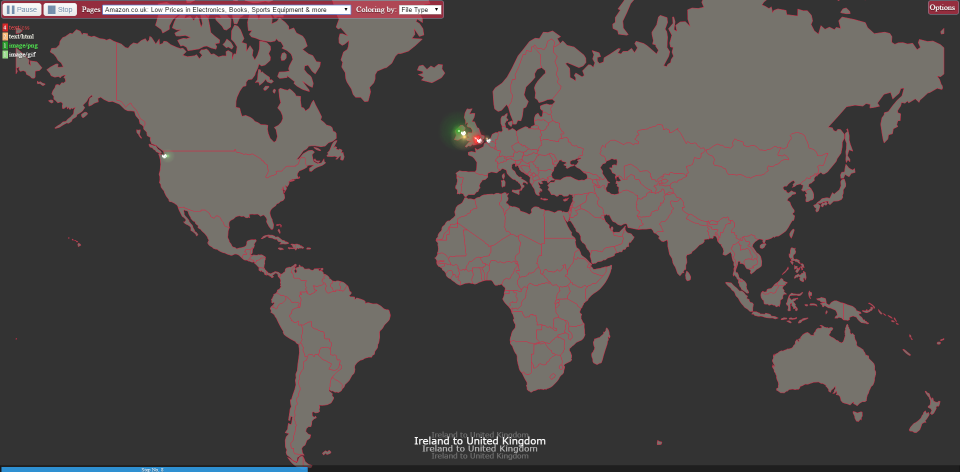
In one of those events, we decided to do a visualisation tool that showed all webpage component requests plotted into a map. That way we could have a glimpse of the effort it takes to serve a single web page.
The data collected via PA3 was an easy accessible repository we had available. An alternative would be WebpageTest, although a few more work would be required to gather the data as we intended.
With the identification of the domain of each component we could use a DNS server to identify its IP.
With that information we were able to use an internal API to fetch geographical data (latitude / longitude) for each of those components.
We used that data against an API which would give us the city / country in which we needed to plot the request on the map.
Information such as the type of object was being requested, its location, size and load time was also being displayed through the use of a tooltip:

Finally we added a counter for the object types as we can see below:

Technology Stack
The project is divided in two main groups.
The backend is done using node.js. We were not forced on the existing technology and we wanted something “out of the box”. The fact that this was an Hackathon project, gave us us some flexibility in testing new things, so it helped in the decision.
The frontend uses D3.js, and the reason for this was to be able to reuse an existing template available in this technology. D3.js is well know for its visualisation characteristics, so it was an easy pick.
The remaining code was done using javascript and jQuery.
Demo
You can see a running demo of this project in this link.
Github
Link for Github Repo

